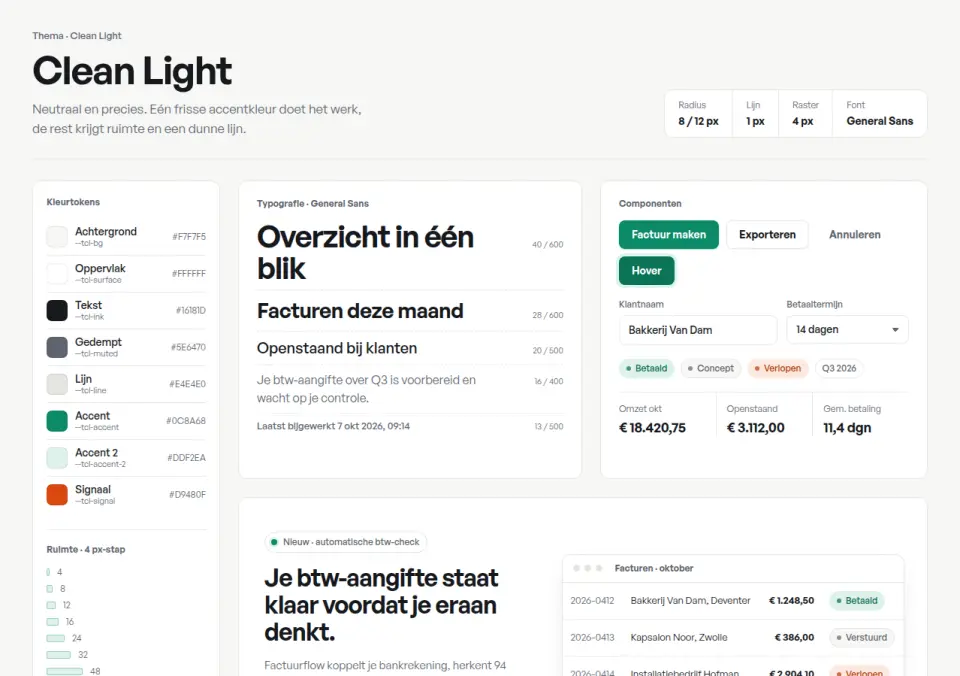
Light, neutral design system with a single fresh mint accent, soft frames and crisp tabular numbers: for software, B2B and financial services that want calm precision.
eigeneigenCSS only
The same content can feel very different depending on colour, type and rhythm. Each theme here is a small design system: palette with tokens, typefaces with a scale, buttons, forms, cards and a sample section. Use them as a starting point for talking about your brand; developers take over the tokens directly.
24 items · Some of these items we built ourselves, some come from open-source libraries with a permissive licence. Every item lists its source and licence.
Nothing found.
Light, neutral design system with a single fresh mint accent, soft frames and crisp tabular numbers: for software, B2B and financial services that want calm precision.
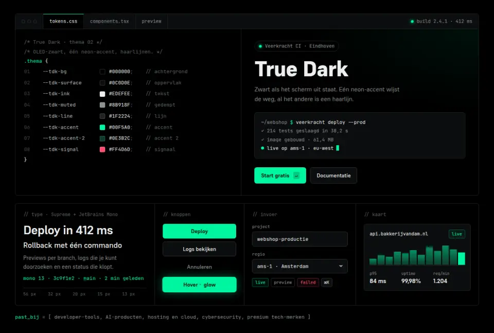
OLED-black design system with a single neon mint accent, 1 px hairlines and monospace labels: for developer tools, AI products and premium tech that live in dark mode.
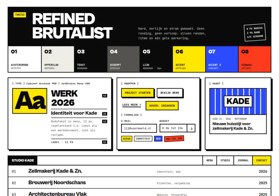
Neo-brutalist design system: black on white, monospaced text, 3 px borders, hard offset shadows and zero radius. For studios, portfolios and statement brands that stay disciplined.
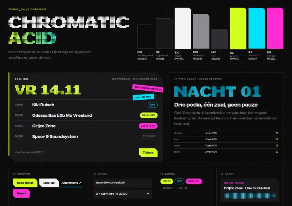
Grey-black base system broken open by three acid colours (chartreuse, cyan, magenta), chamfered corners and a geometric display face: for music, gaming and events.
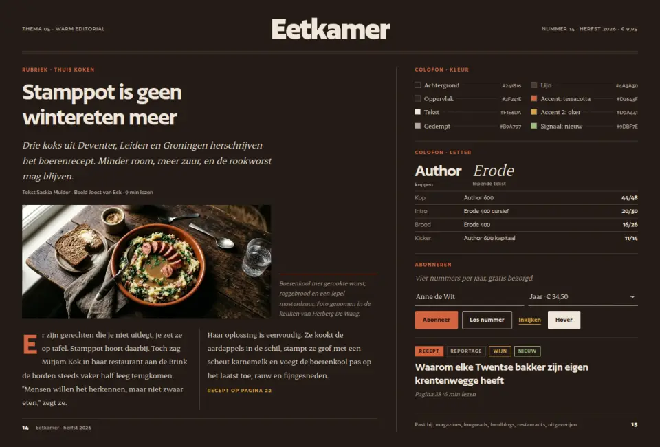
Magazine system on a warm charcoal-brown base with a terracotta accent, a tight grotesque for headlines and a readable serif for long text: for magazines, longreads and food.
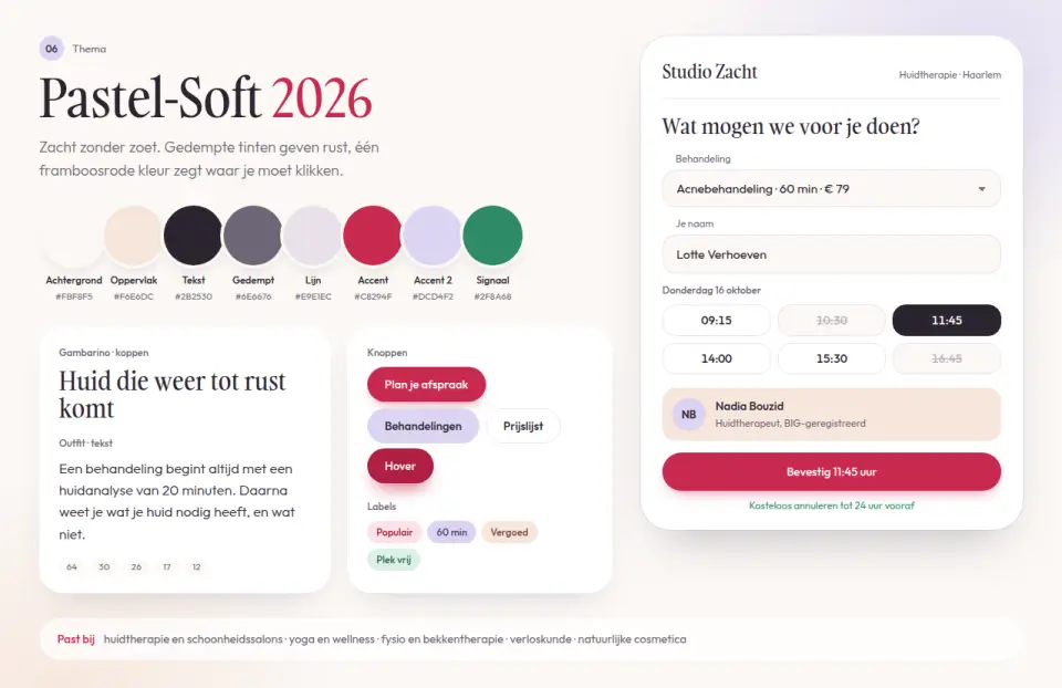
Modern pastel system: muted lavender and peach on off-white, one saturated raspberry accent, generous radius and a soft serif for headings. For wellness, beauty and skin therapy.
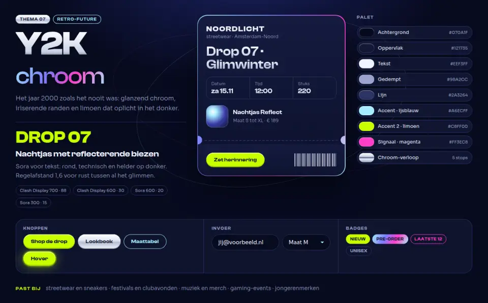
Cyber Y2K, updated: chrome gradients, iridescent blue-magenta, icy blue and electric lime on deep night blue, with capsule shapes and ticket cut-outs. For streetwear, events and music.
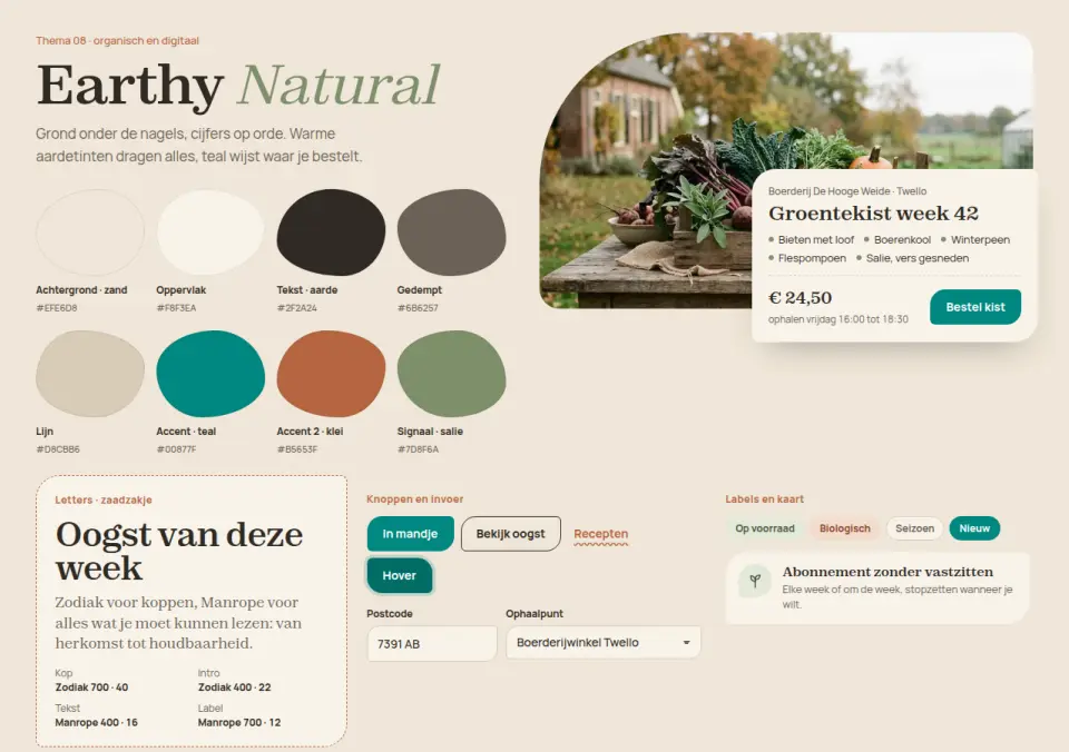
Organic design system built on sand, clay and sage, with organic rounded shapes and a single electric teal accent for actions. For farm shops, eco brands, food and lifestyle.
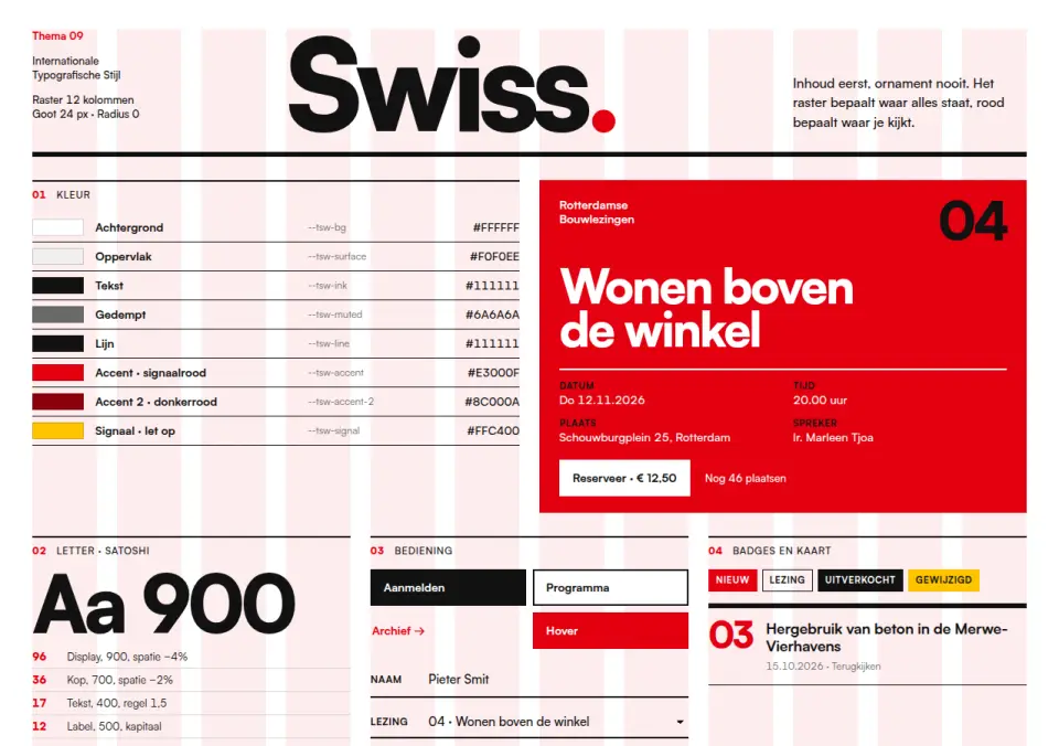
Swiss design system after the International Typographic Style: visible 12-column grid, flush-left grotesque, red and black, zero radius and hard rules. For architects, cultural institutions and B2B that want to show clarity.
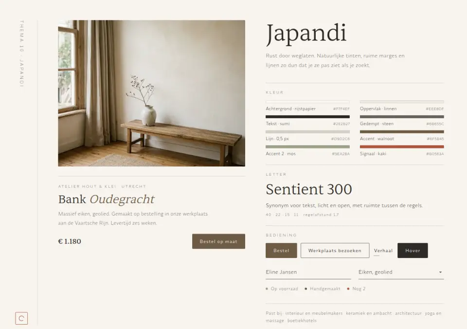
Japanese-Scandinavian design system: lots of white space, natural walnut, moss and persimmon tones, hairlines, small type and a light serif. For interiors, furniture makers, ceramics and calm wellness.
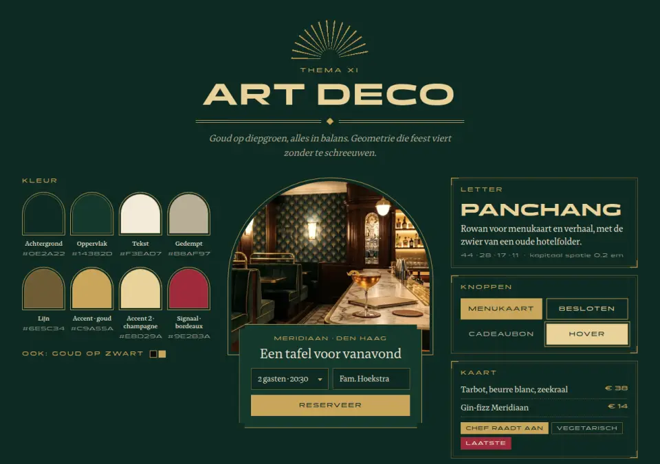
Art deco design system: gold on deep green, symmetrical compositions, fan motifs, arches, stepped corners and wide capitals next to a classic serif. For upscale hospitality, hotels, cocktail bars and jewellers.

Accessible healthcare theme: all text meets WCAG AAA (contrast 7:1 or higher), 18 px base size, large tap targets, a visible focus ring and messages that never rely on colour alone. Friendly and clear for GP practices, pharmacies and home care.
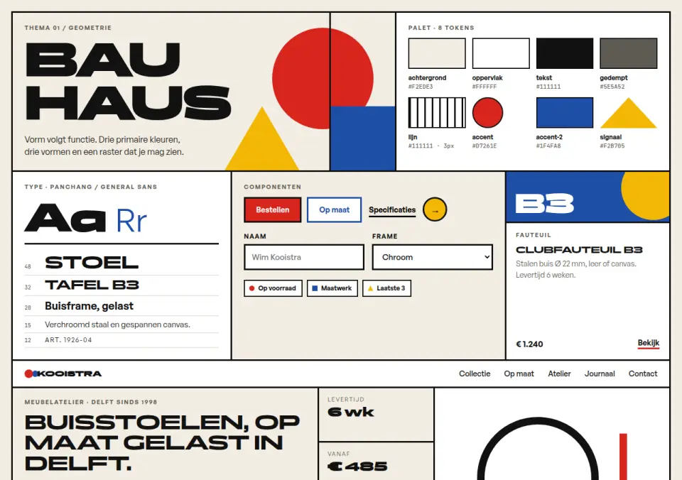
Primary colours, circle, square and triangle on a visible black grid. For brands that want to show craft and design.
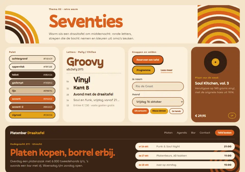
Warm orange, rust brown and mustard, round retro type, stripes that bend around corners and full pill shapes. For hospitality, record shops and brands with a wink.
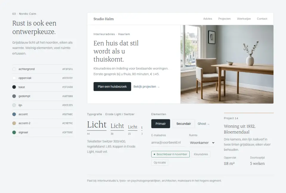
Pale grey-blue, oak and lots of air: hairlines, light weights, little per screen. For interiors, care and advisory practices that want to feel calm.
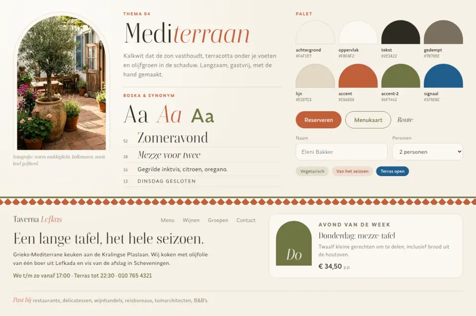
Terracotta, olive and limewash with arches, tile borders and an italic serif. For restaurants, delis, travel and garden designers with sunshine in the brand.
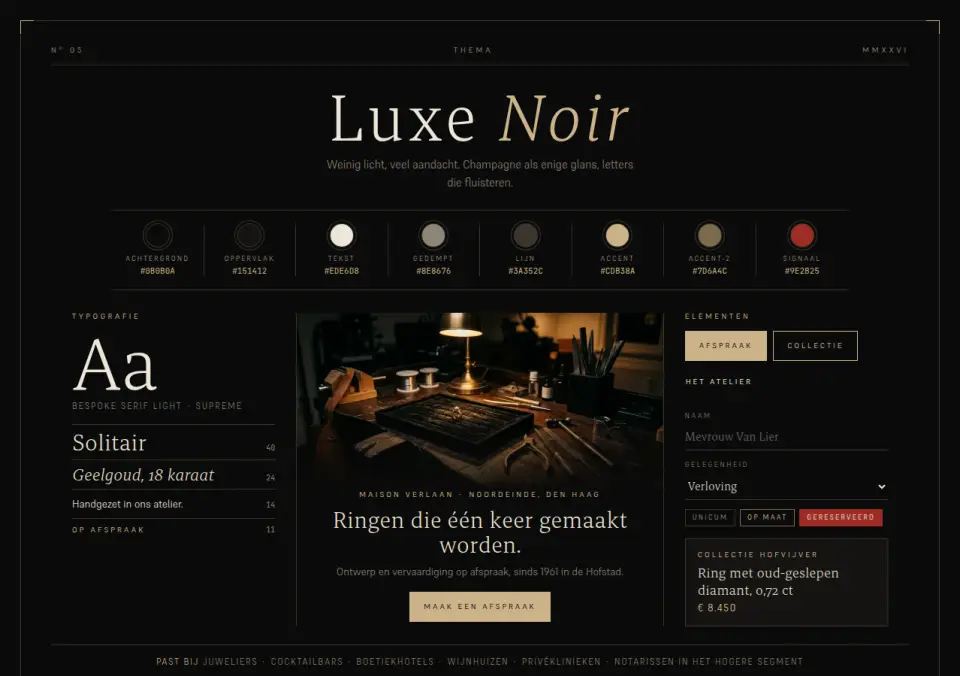
Near-black with champagne hairlines, a thin serif and widely tracked capitals in a symmetrical layout. For jewellers, cocktail bars, hotels and exclusive services.
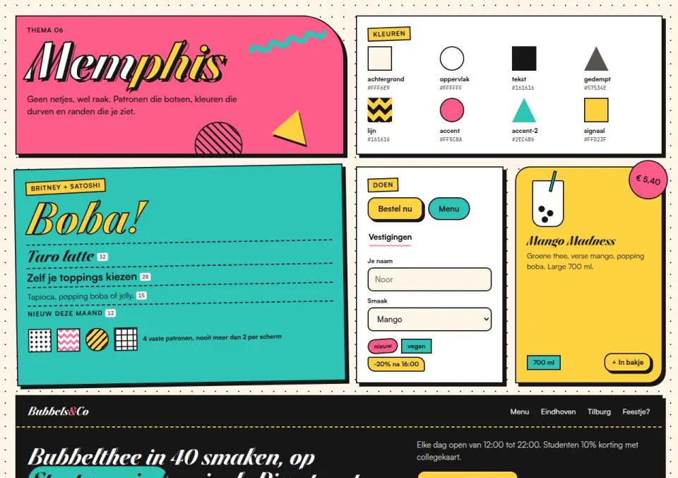
Pink, turquoise and yellow with squiggles, dots, zigzags and hard black borders with offset shadows. For young brands, childcare, food concepts and events.
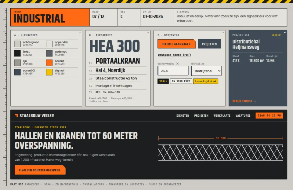
Concrete, steel and one orange signal colour, laid out like a technical drawing sheet with dimension lines, title blocks and hazard stripes. For construction, steel, installation and logistics.
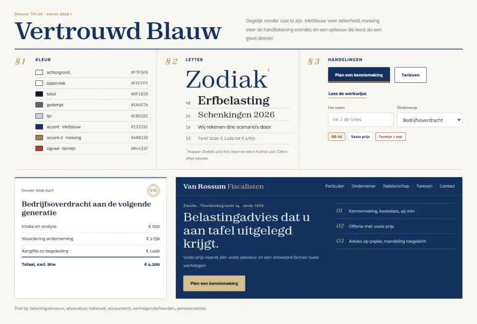
Ink blue and brass on paper white, laid out like a case file: section numbers, double rules, tabular figures and footnotes. Trust without the default bank blue. For tax advisers, lawyers, notaries and wealth managers.
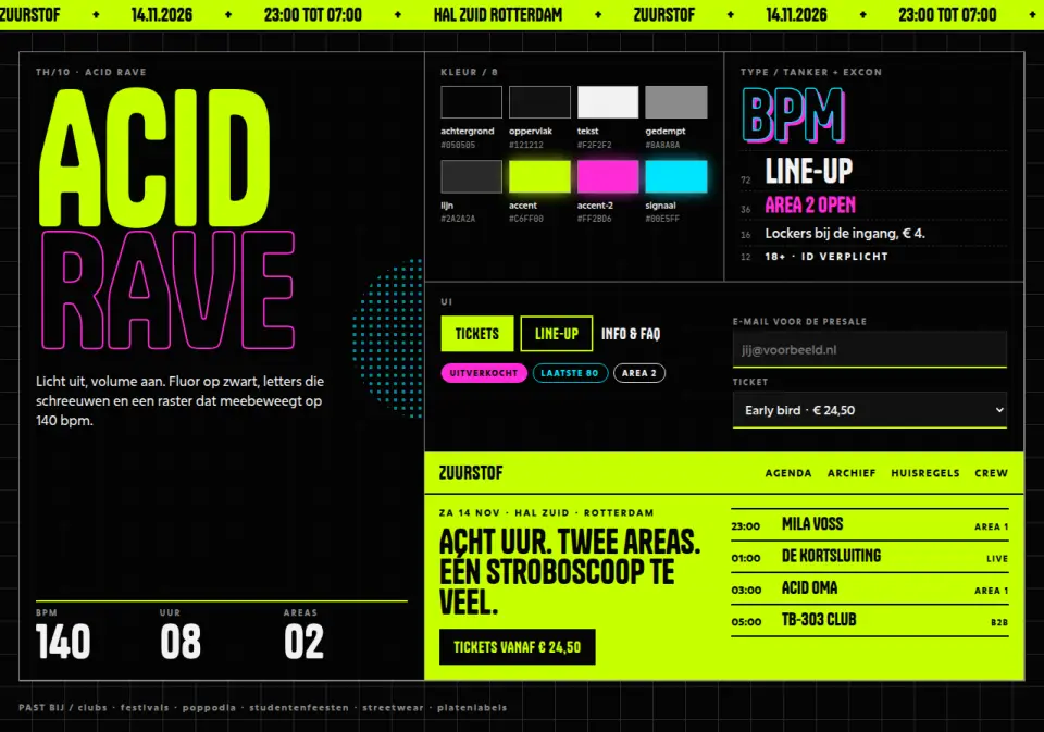
Fluorescent green, pink and UV cyan on deep black, with flyer type, a running ticker band and a line-up as timetable. For clubs, festivals, events and nightlife.
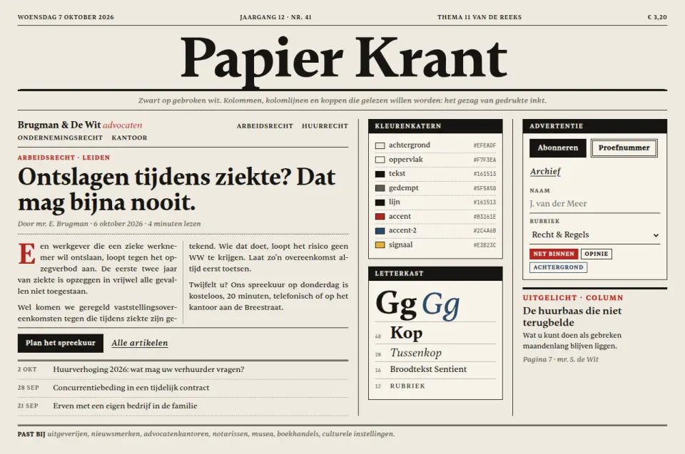
Newsprint, black ink and one red support colour: masthead, columns with column rules, drop caps and datelines. For media, publishers, law firms and brands that want authority.
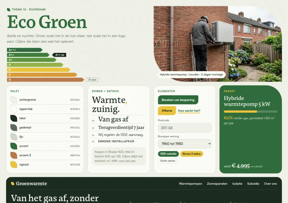
Earthy leaf green, clay and sun yellow with leaf shapes, contour lines and an energy-label scale as recurring motif. For installers, energy advice, solar and sustainable building.
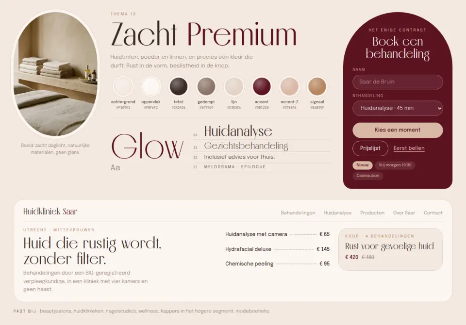
Powder, nude and caramel with one deep burgundy as contrast: oval image frames, pill shapes and a tall slender display face. For beauty salons, skin clinics, wellness and fashion.
Add it to your selection and send it over. We build your site around it, in your brand.
Get in touch →