Zachte schaduw en warme gloed New
Two calm hover states for product cards: a layered shadow that blooms with a 2 px lift, and a warm glow in the brand colour with a thin border. The shadow sits on a pseudo element where only opacity animates, so no janky box-shadow transition. For shops and service overviews where the image should do the work.
How to use it
- Paste the HTML where the components should appear.
- Add the CSS to your stylesheet. All classes are prefixed, so nothing clashes with your own styles.
- No JavaScript needed.
<!-- Zachte schaduw en warme gloed · NedDev · eigen werk. -->
<div class="jouw-container">
<div class="hsr">
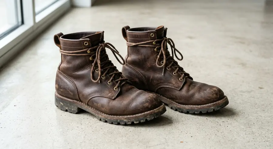
<a class="hsr__card hsr__card--shadow" href="#hv-schaduw-rustig"><span class="hsr__img"><img src="https://neddev.com/lab-media/hv-schaduw-rustig-1.webp" alt="" width="900" height="491" loading="lazy"></span><span class="hsr__row"><span class="hsr__n">Leren werkschoen Veenendaal</span><span class="hsr__p">€ 149</span></span><span class="hsr__k">Zachte schaduw</span></a>
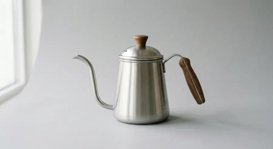
<a class="hsr__card hsr__card--glow" href="#hv-schaduw-rustig"><span class="hsr__img"><img src="https://neddev.com/lab-media/hv-schaduw-rustig-2.webp" alt="" width="900" height="491" loading="lazy"></span><span class="hsr__row"><span class="hsr__n">Schenkketel RVS 0,6 liter</span><span class="hsr__p">€ 54,95</span></span><span class="hsr__k">Warme gloed</span></a>
</div>
</div>
/* Zachte schaduw en warme gloed · NedDev · eigen werk. */
.hsr{position:absolute;inset:0;display:grid;grid-template-columns:1fr 1fr;gap:18px;padding:20px 22px;background:#f4f3f1;font-family:'Switzer',sans-serif;color:#0a0a0a;container-type:size;text-align:left}
.hsr *,.hsr *::before,.hsr *::after{box-sizing:border-box}
.hsr__card{position:relative;display:flex;flex-direction:column;min-height:0;background:#fff;border-radius:8px;color:inherit;text-decoration:none;outline:none;transition:transform .25s cubic-bezier(.2,.7,.3,1)}
.hsr__card::before,.hsr__card::after{content:'';position:absolute;inset:0;border-radius:8px;pointer-events:none;transition:opacity .3s ease}
.hsr__card::before{box-shadow:0 1px 2px rgba(10,10,10,.06),0 2px 6px rgba(10,10,10,.04)}
.hsr__card::after{opacity:0}
.hsr__card--shadow::after{box-shadow:0 1px 2px rgba(10,10,10,.05),0 6px 12px -4px rgba(10,10,10,.08),0 18px 32px -12px rgba(10,10,10,.18)}
.hsr__card--glow::after{box-shadow:0 0 0 1px rgba(245,72,15,.55),0 10px 30px -10px rgba(245,72,15,.45)}
.hsr__card:hover,.hsr__card:focus-visible{transform:translateY(-2px)}
.hsr__card:hover::after,.hsr__card:focus-visible::after{opacity:1}
.hsr__card:focus-visible{box-shadow:0 0 0 2px #f4f3f1,0 0 0 4px #0a0a0a}
.hsr__img{flex:1;min-height:0;overflow:hidden;border-radius:8px 8px 0 0}
.hsr__img img{display:block;width:100%;height:100%;object-fit:cover}
.hsr__row{display:flex;justify-content:space-between;align-items:baseline;gap:8px;padding:9px 12px 2px}
.hsr__n{font:500 13px/1.25 'Switzer',sans-serif;min-width:0}
.hsr__p{font:600 13px/1.25 'Switzer',sans-serif;font-variant-numeric:tabular-nums;white-space:nowrap}
.hsr__k{padding:0 12px 10px;font:400 12px/1.3 'Switzer',sans-serif;color:#6a665f}
@container (max-height:230px){.hsr{padding:14px 14px;gap:12px}.hsr__row{padding:7px 10px 1px}.hsr__k{padding:0 10px 7px}}
@container (max-width:380px){.hsr__row{flex-direction:column;gap:1px}.hsr__n,.hsr__p{font-size:12px}.hsr__k{display:none}}
@media (prefers-reduced-motion:reduce){.hsr__card{transition:none}.hsr__card:hover,.hsr__card:focus-visible{transform:none}}More components
Seen something you like?
Add it to your selection and send it over. We build your site around it, in your brand.
Get in touch →